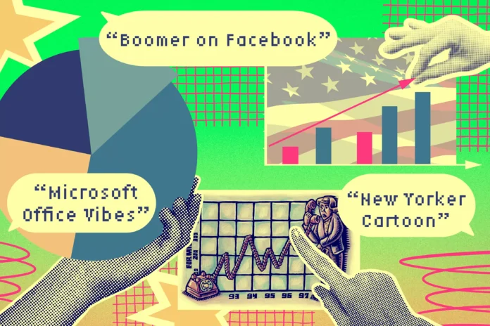
In today’s digital age, data visualizations have become an essential tool for communicating complex information in a simplified and visually appealing manner. From charts and graphs to infographics and dashboards, data visualizations are used in various fields, including journalism, business, and academia. However, a recent study has found that the design elements of these visualizations can significantly influence viewers’ assumptions about the source of the information and its trustworthiness.
The study, conducted by researchers at the University of California, Davis, and the University of Washington, examined how design elements such as color, font, and layout can shape viewers’ perceptions of data visualizations. The researchers showed participants different versions of a data visualization, varying the design elements, and then asked them to rate the trustworthiness of the information and the source.
The results of the study were eye-opening. The researchers found that design elements can significantly impact viewers’ assumptions about the source of the information. For example, when the visualization had a simple and clean design with minimal colors and fonts, viewers were more likely to assume that the information came from a credible and trustworthy source. On the other hand, when the visualization had a cluttered and chaotic design with bright colors and multiple fonts, viewers were more likely to question the credibility of the information and the source.
One of the most interesting findings of the study was that viewers’ assumptions about the source of the information were influenced by the design elements even when the content of the visualization was the same. This means that the design elements can overshadow the actual data and impact viewers’ trust in the information, regardless of its accuracy.
So, why do design elements play such a significant role in shaping viewers’ assumptions about data visualizations? The researchers suggest that it is because design elements can evoke emotions and create a particular aesthetic that influences viewers’ perceptions. For example, a visualization with a professional and polished design can evoke a sense of authority and credibility, while a poorly designed one can create doubts and skepticism.
The study also found that viewers’ assumptions about the source of the information were influenced by their prior beliefs and biases. For example, if a viewer already had a negative perception of a particular source, they were more likely to question the credibility of the information, even if the design elements suggested otherwise. This highlights the importance of being aware of our biases and being critical thinkers when consuming visualized data.
The implications of this study are significant, especially in today’s world, where misinformation and fake news are rampant. Data visualizations are often used to support arguments and persuade viewers, but the study suggests that the design elements can impact the effectiveness of these visualizations. Therefore, it is crucial for designers and creators of data visualizations to be mindful of the design elements they use and how they can influence viewers’ assumptions.
Moreover, the study also has implications for the credibility of data journalism and academic research. As data visualizations are commonly used in these fields, it is essential to ensure that the design elements do not overshadow the accuracy and validity of the information. Journalists and researchers must be transparent about their data sources and the design choices they make to maintain trust with their audience.
In conclusion, the study highlights the need for a critical examination of the design elements used in data visualizations. As viewers, we must be aware of how design elements can influence our assumptions about the information and its source. And as creators, we must be responsible for using design elements that accurately represent the data and do not manipulate viewers’ perceptions. With this awareness, we can ensure that data visualizations continue to be a powerful tool for communicating information in a trustworthy and impactful manner.

